


As soon as the Covid-19 pandemic began, restaurants and bars quickly became one of the worst-hit industries. A small local bakery called Momo Cakes, founded by my friend Hanna, is trying to see this as an opportunity instead to grow their business online.
Although they already have an Instagram account to showcase their products, taking online orders through direct messaging soon become a headache to manage when the demand suddenly rose so drastically. I was therefore asked by the founder to create a mobile app that allows customers to easily order and customize cakes and other desserts that can be either delivered or picked up at their store.
To understand the needs from the user's perspective, I did preliminary user research using surveys and interviews within the existing customer group of Momo cakes by contacting their Instagram followers. I focused on identifying which of their needs cannot be satisfied by placing an order through direct phone calls or through Instagram direct messaging.
From this round of surveys and interviews, two main user archetypes were identified, and their user journey were mapped respectively:

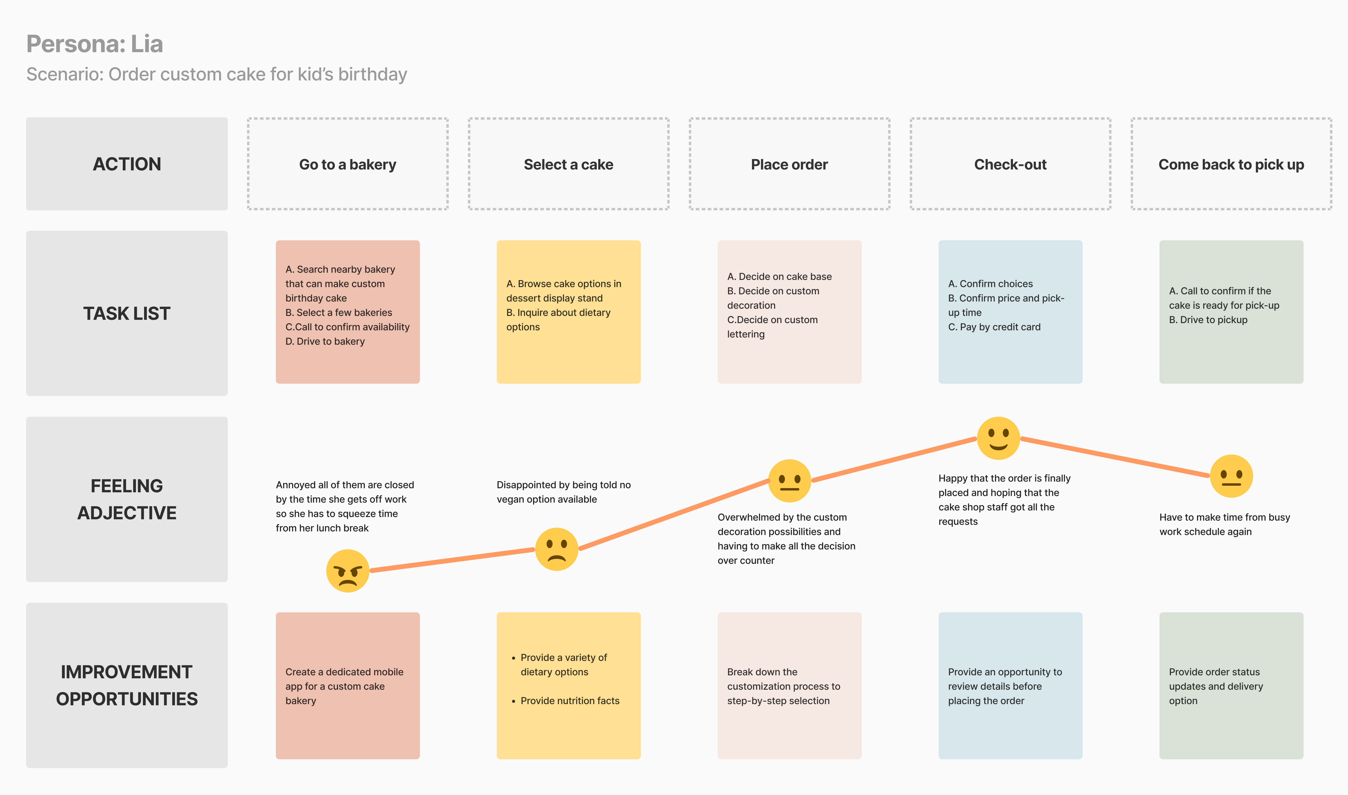
Traditionally Lia would have to go to a bakery to see the options and express her dietary requests in person and come back to pick up the cake.
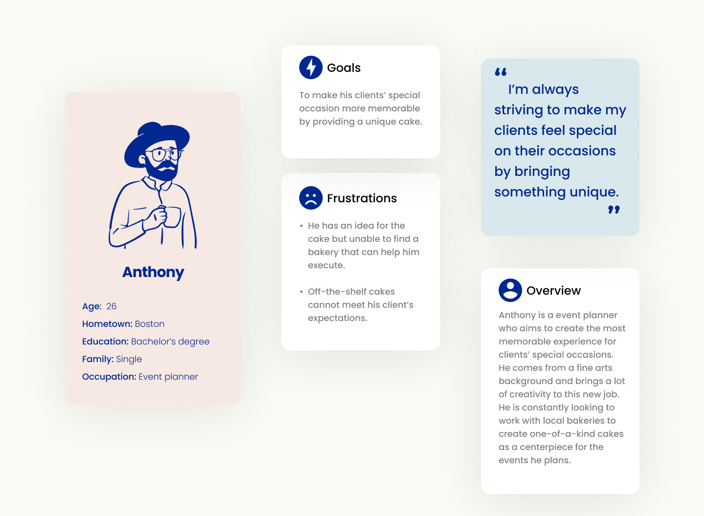
Traditionally Anthony would have to schedule a consultation session with the bakery and discuss the design, and then have multiple phone calls to arrange delivery details.
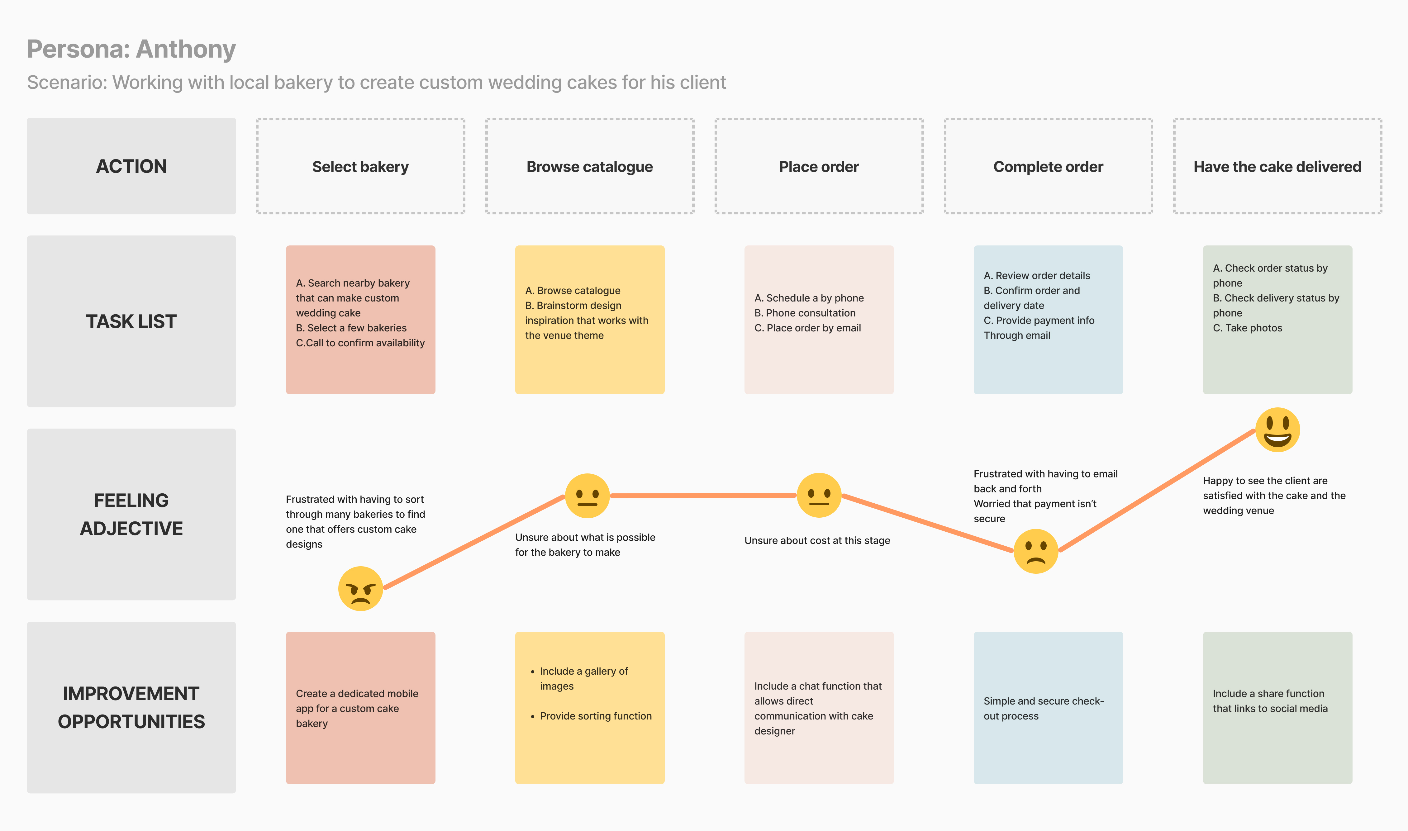
Through initial user research, four major pain points of the existing ordering experience were identified:
Food delivery apps does not provide enough options for customization.
Hard to track progress of order and delivery
Communications over phone or messaging often lead to mistakes or misunderstanding.
Calling or messaging makes it hard to keep track of multiple orders at the same time.
How might we create a streamlined experience to allow customers to order custom desserts quickly and easily?
Four main goals were outlined targeting on solving the paint points above for the users:

Provide customer standard options as well as unique opportunities to create

Allow tracking of order and delivery status

Streamline payment process

Allow customers to see past orders, save favorites and manage multiple orders
Due to the limitations of time and budget, we understand it is unrealistic to offer unlimited customizable options, so it is important to figure out which parameters to customize are essential for customers to have from Day One, and which other features are of lower priority and could be implemented later on in the process.
I started the ideation process by sketching out the storyboard, both big-picture and close-up, which helps to identify the user flow of placing an order.


From here I developed a premilinary user flow:
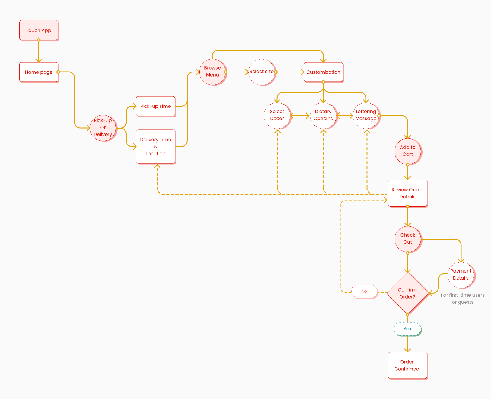
Working through a couple versions of preliminary sketches, I was able to quickly iterate through ideas and filter out which layout to take to the digital wireframing stage.
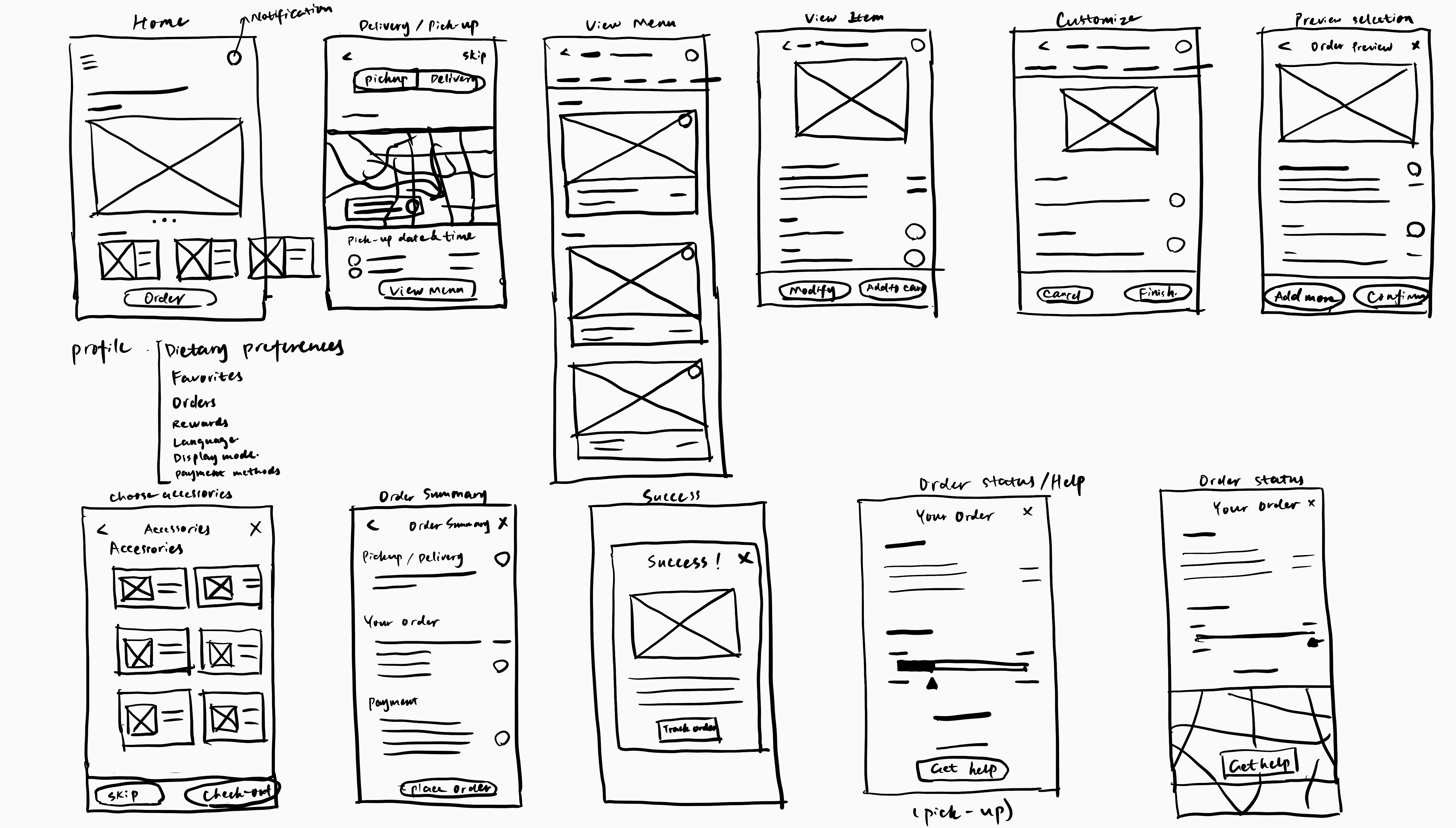
Taking the sketches to Low-fedelity wireframes allows me to flush out what information are critical to show and how to present them in an organized way. We realized having unlimited options for customers to customize is not necessarily a good thing, as having too many options could be tiring to go through for the customers. So it is important to strike a balance between selection and open-ended questions.
I conducted the first round of usability testing after the Lo-fi prototype was completed. The study was unmoderated, with 5 participants chosen from Momo's Instagram followers. KPI included System Usability Scale(SUS), time-on-task and conversion rate.
Most of the participants find it frustrating to have to choose pickup or delivery before seeing the menu.
For most users, navigation to a separate page for customization has too many steps.
Many participants found order summary have redundant pages.
Users need a simpler path to get to the menu page
Users need to be able to sort and filter the menu.
Users need to get customization done in fewer clicks
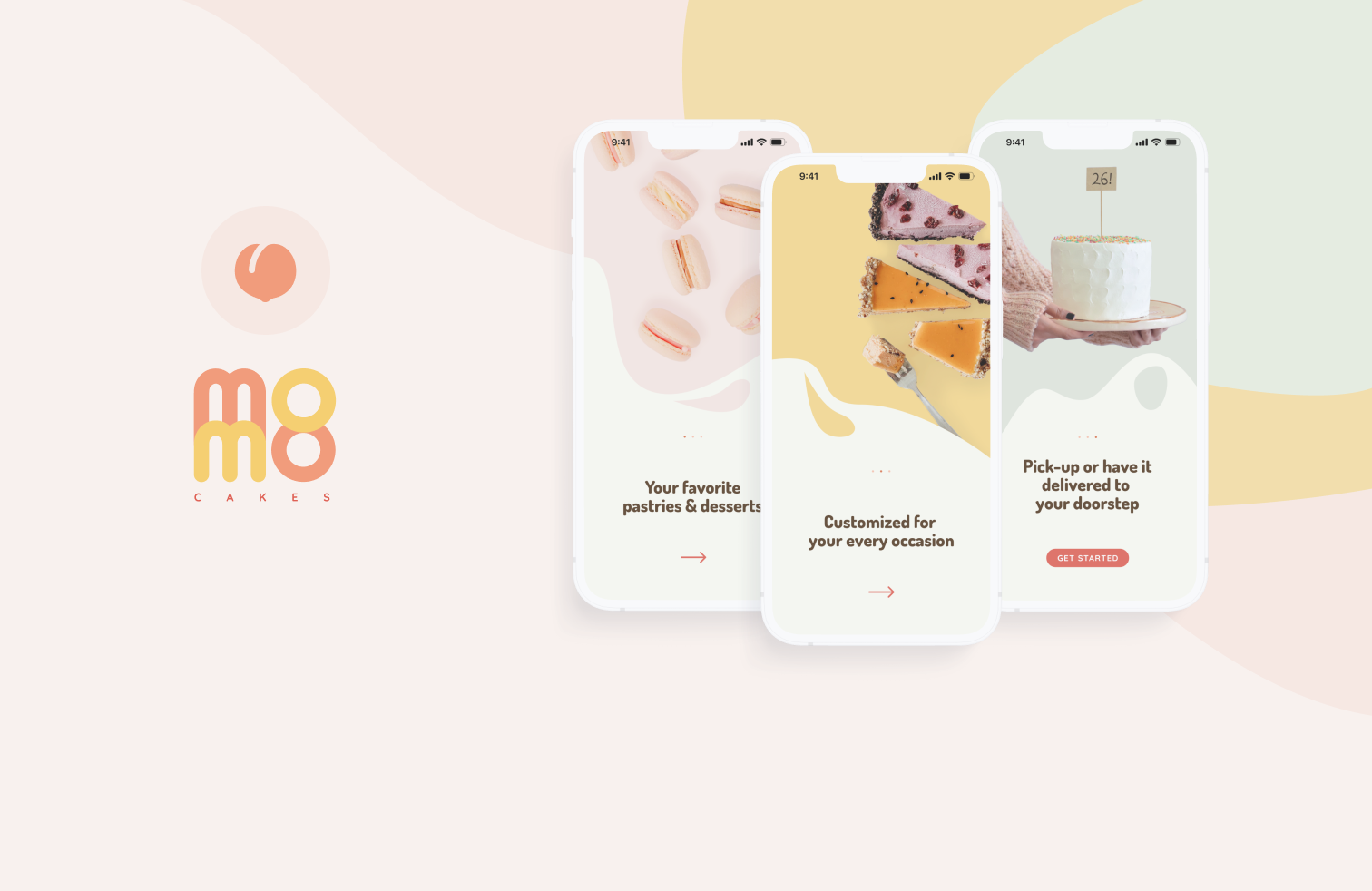
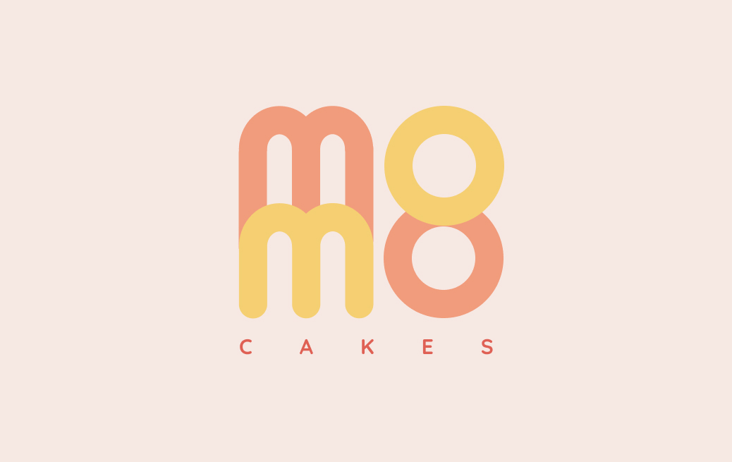
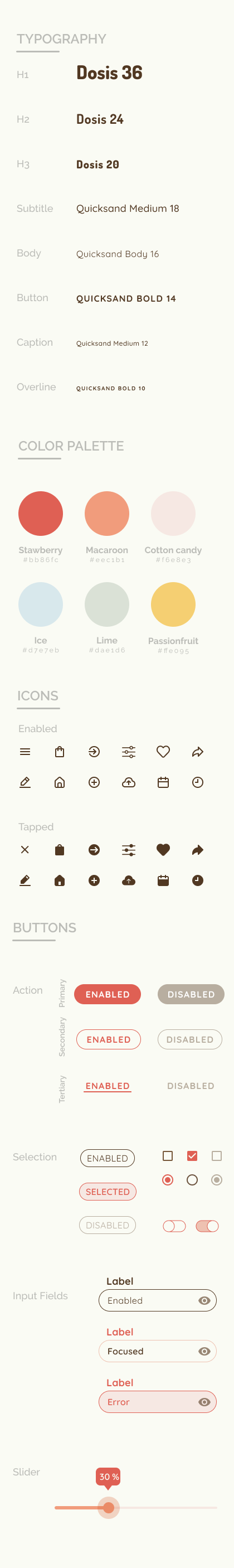
The owner also asked me to design branding and visual identity for the business. This is critical for the development of the next iteration of the mobile prototype.
Full branding package can be accessed here.
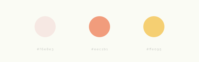
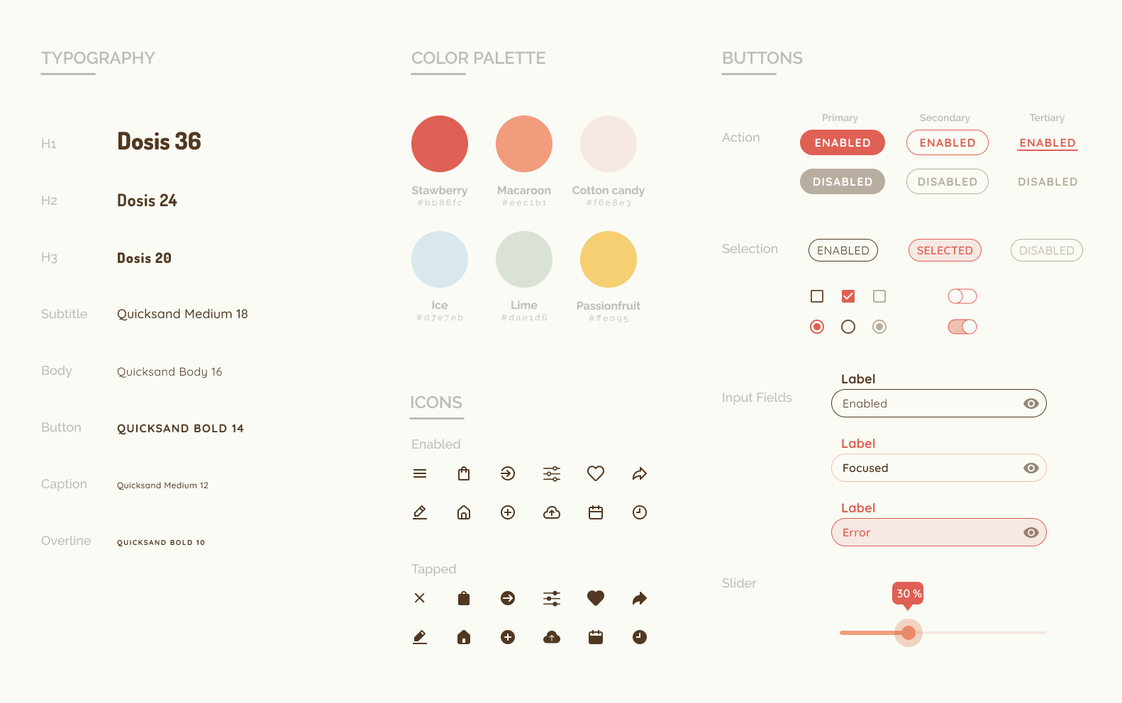
Building upon the brand design, I created a design system for the mobile app using a colorful palette with macaroon-inspired color such as pastel pink/green/mustard/blue, echoing the ethos of the brand. The choice of the typeface, Dosis and Quicksand, accentuates the playful vibe we want to convey through the interface.
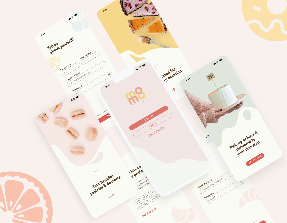
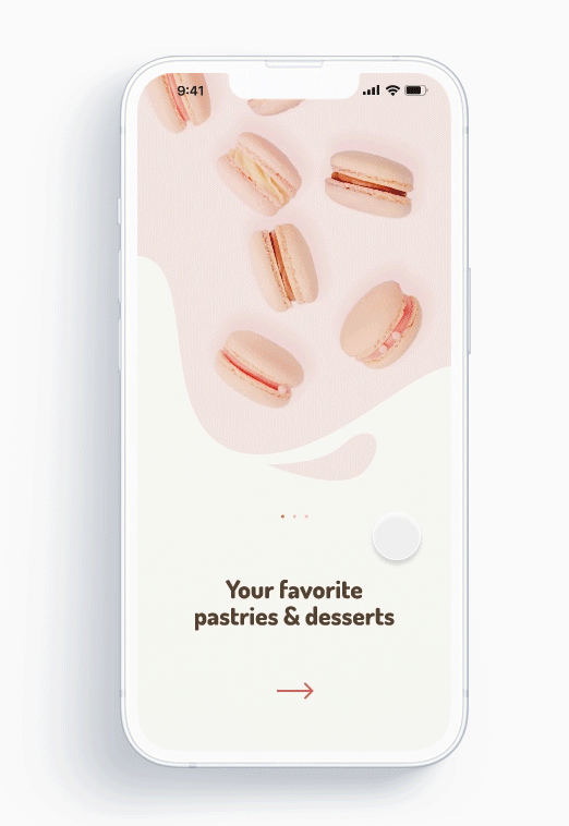
Onboarding experience for first-time users give the users a brief intro to the features using simple catch phrases and high-res images to create an appealing and appetizing first impression.
Users can navigate through using either swipe or tapping the arrows.
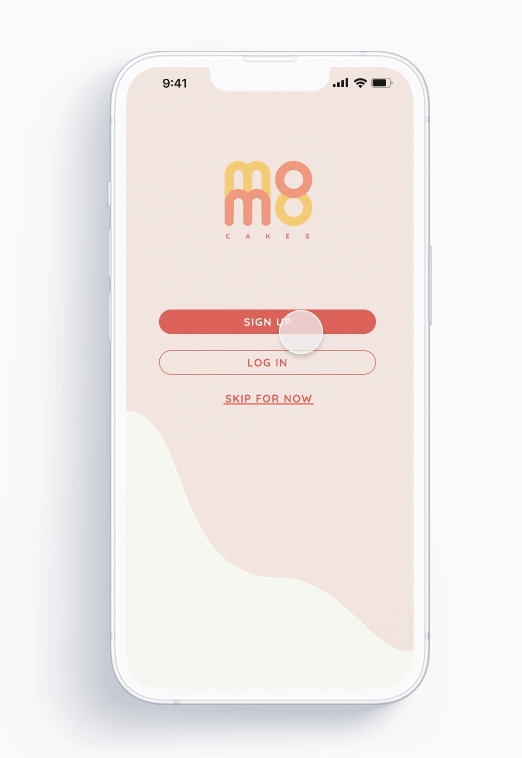
Sign up experience for first-time users allows users to fill in their dietary preferences in addition to standard log in details so that the app can give them customized recommendations later on.
They also have the option to skip this step and revisit this in the account page.

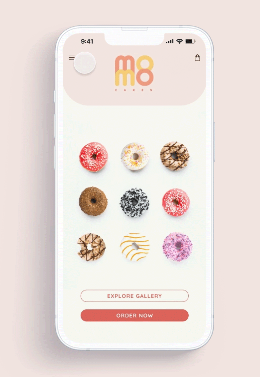
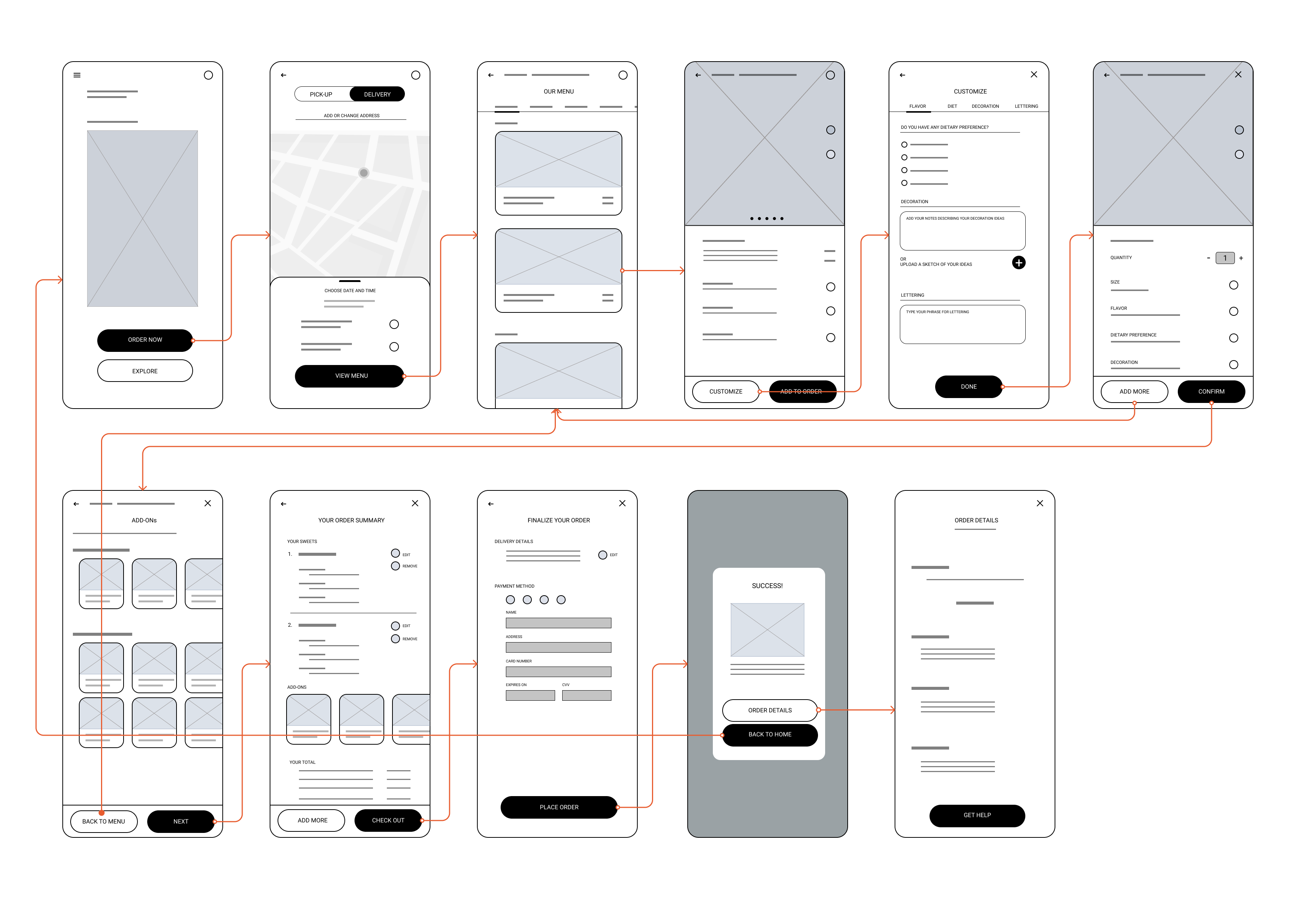
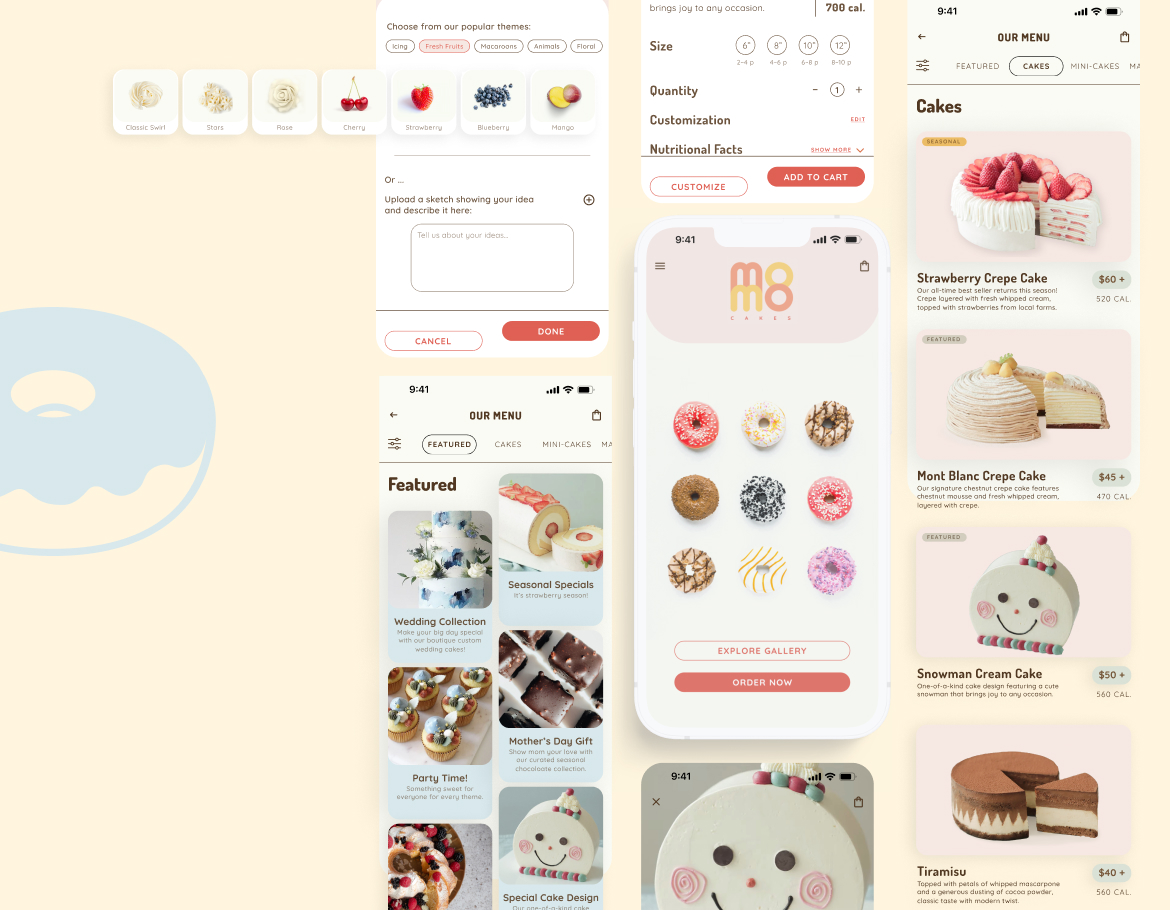
Home screen greets the users with gif image of rotating featured product of the season to create a fun and lovable experience.
Hamburger menu on top left gives users access to account and order information.
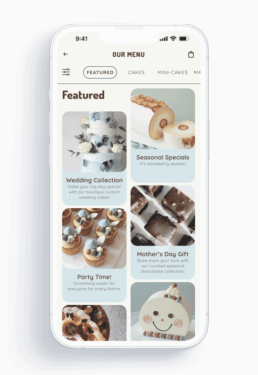
Menu items are sorted by categories and visually grouped by background colors. Users can view the menu items through tapping on the top bar or scrolling.
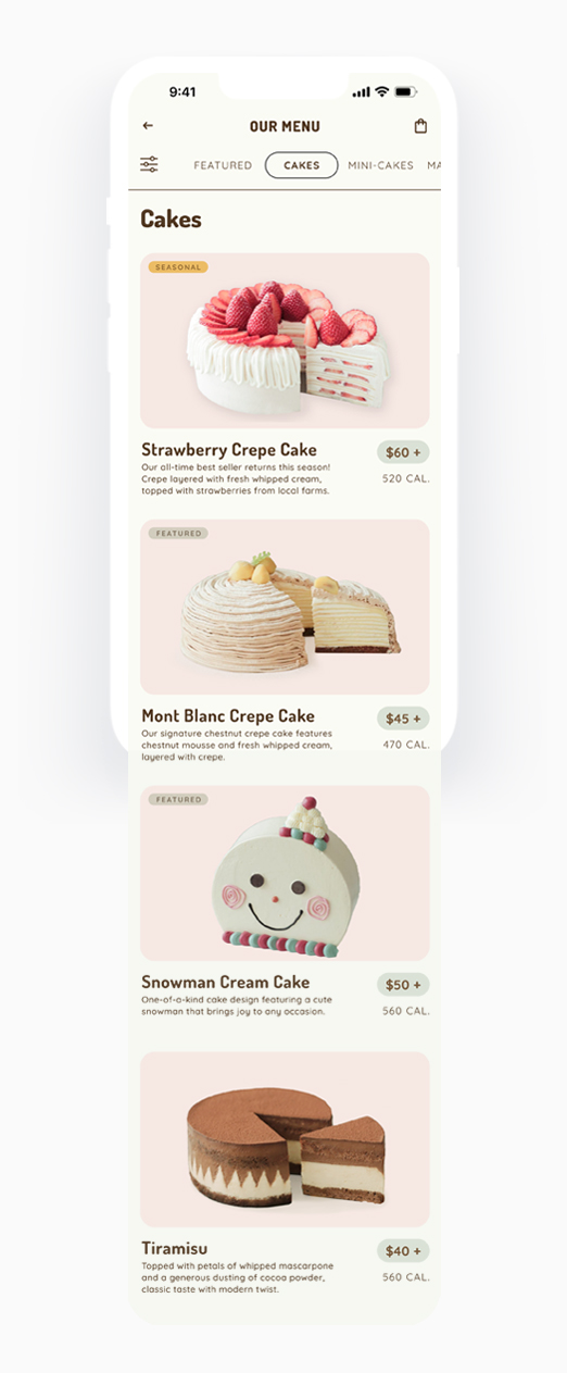
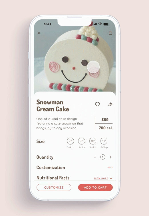
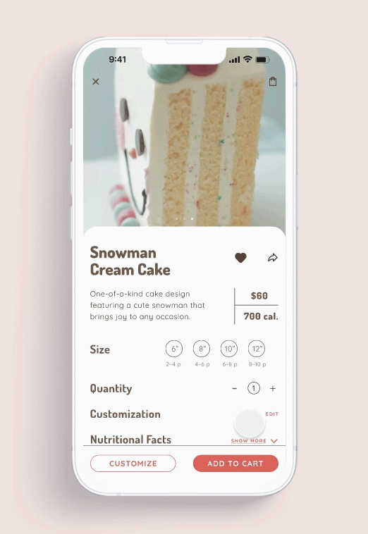
Users can click into each card from the main menu and view detailed information of the items and save as favorites or share. They can also view the detailed nutritional facts when expanding the "Show more" button.
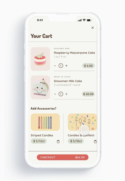
From here, they can choose to further customize an item or directly add to cart.
This feature allows users to fully customize the dietary options, decoration and lettering message of the cakes. They can tweak the sweetness level, or choose special diet options and tweak the style of the cake.

Users can tweak the level of added sugar and put. in special diet request
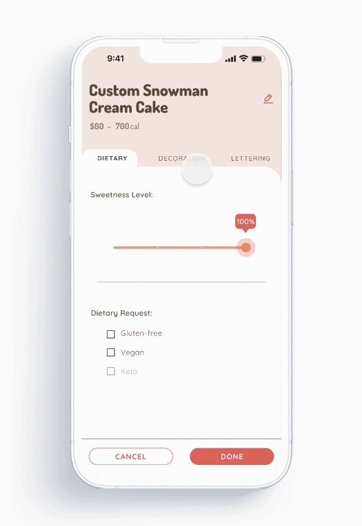
Users can tweak the style of the cake based on existing themes, or upload a sketch image if they want to get creative
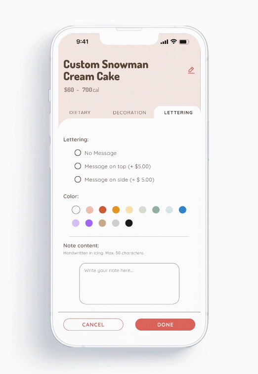
Users can add their message and choose the color and style of the lettering
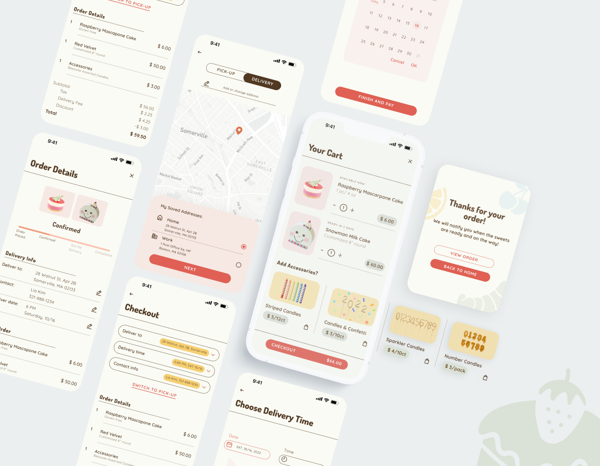
To check out an order, users need to select pick-up or delivery locations and time, and fill in their payment details and then the order is confirmed.
Users can decide whether they want to get their order delivered or picked up, and choose date and time for either.
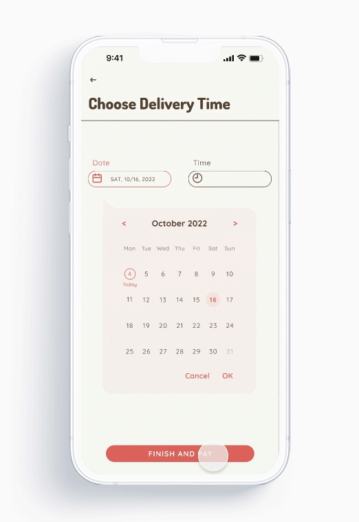
As the last step of check-out user flow, users are prompted to confirm deliver date, time and payment details.
We plan to conduct another round of usability study based on the Hi-Fi prototypes to find out if the revised user flow is easy to use.
Accessibility was already taken into consideration when designing the Hi-Fi prototypes, but we would like to validate it through real users. In the future, we might want to add more accessible features, such as adjustable text sizes and high contrast mode.
In tandem with the mobile app, we are going to build a responsive web app for the owner to manage, track orders and inventories.